A cozy game loop wrapped around real studying.
The starting idea: studying is easier to keep up when yesterday's hour leaves something behind. I wanted the reward to last. Instead of a score that resets, you get a room that fills up and becomes yours.
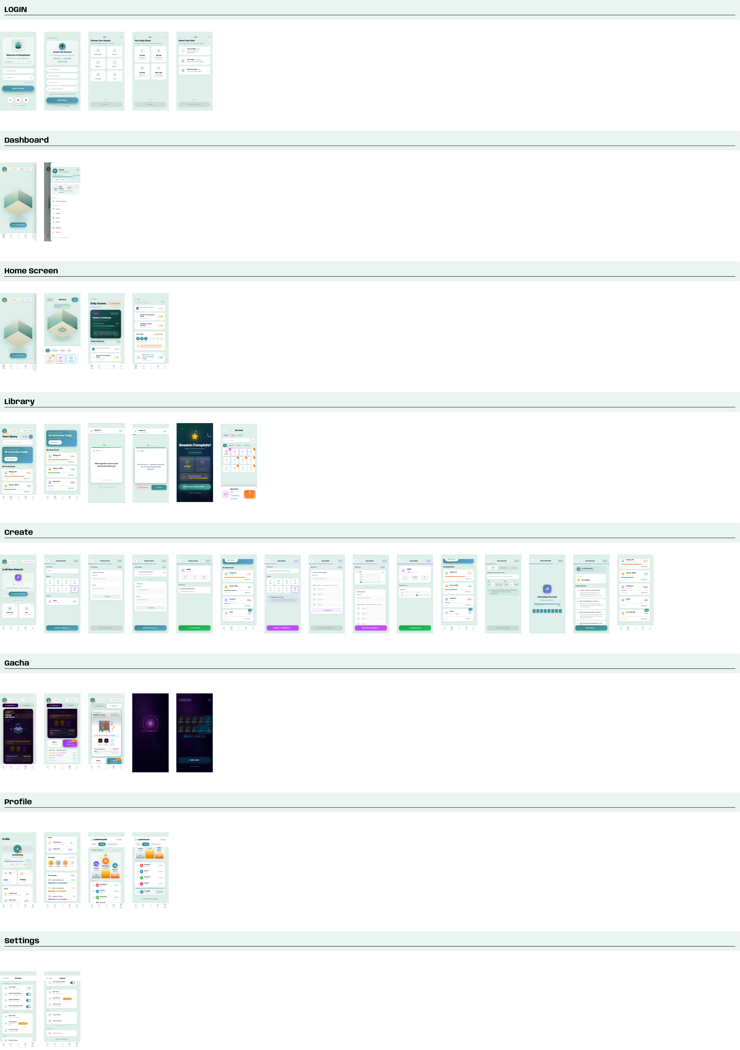
I designed v1 in Figma: information architecture, a full variable-based design system and more than 40 prototype screens. Then I ran a heuristic audit on my own work. It scored 2.6 out of 5. v2 is my answer to that audit: a working prototype you can play below, with the reward loop, shop and settings a live app would need.
- v1
- More than 40 Figma screens: onboarding, home, library, create, rewards, profile and settings.
- Audit
- 2.6 out of 5 on my own review (Nielsen heuristics and WCAG).
- v2
- A working prototype that fixes every problem the audit flagged. Study, earn, decorate, come back. The room is the home screen.
v1: personas, IA, a variable system and a clickable prototype.
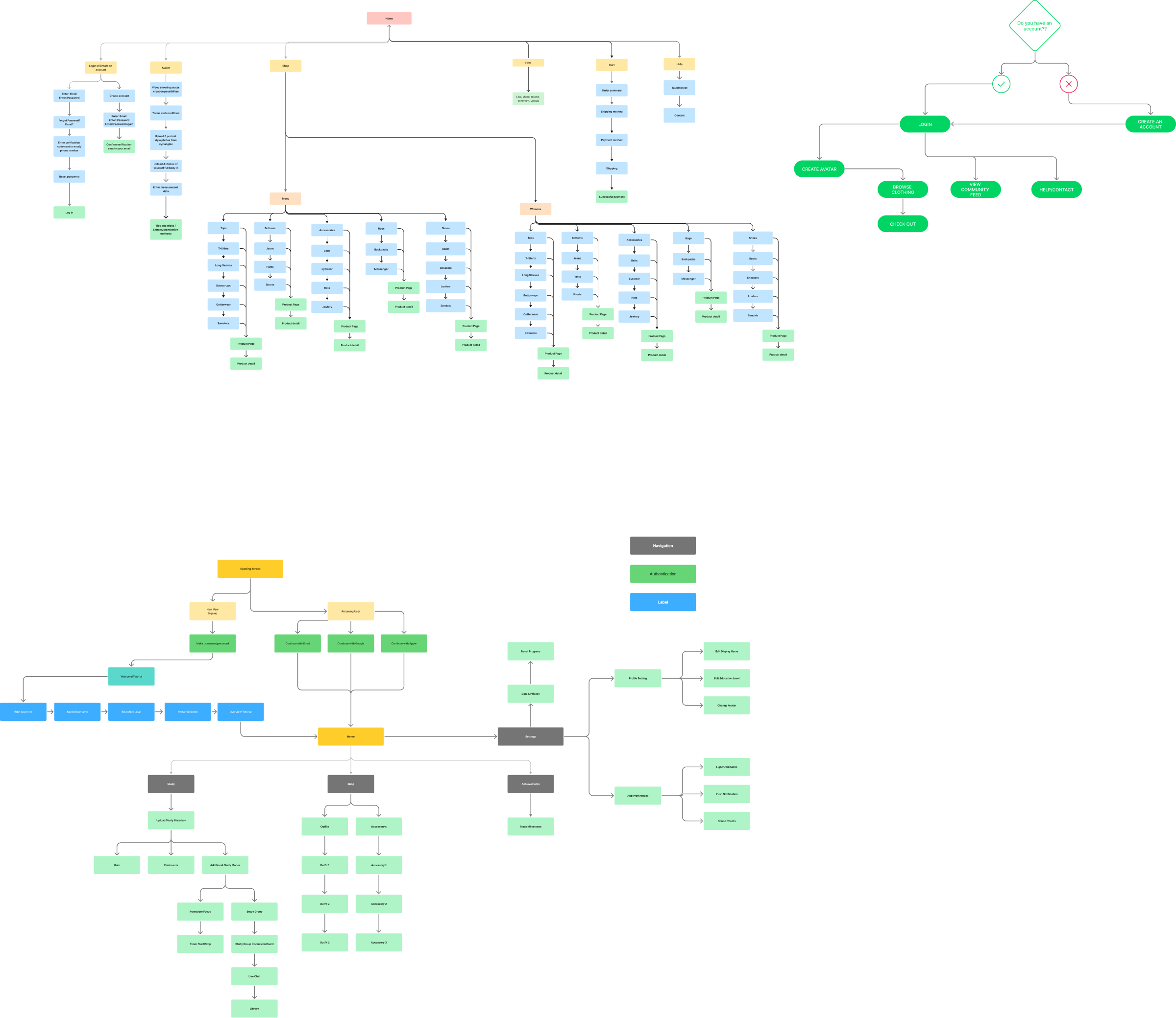
I started with the sitemap. Onboarding splits new and returning players. Home branches into Study (quizzes, flashcards, Pomodoro, study groups), Shop (outfits and accessories) and Achievements, and Settings holds profile and app preferences.
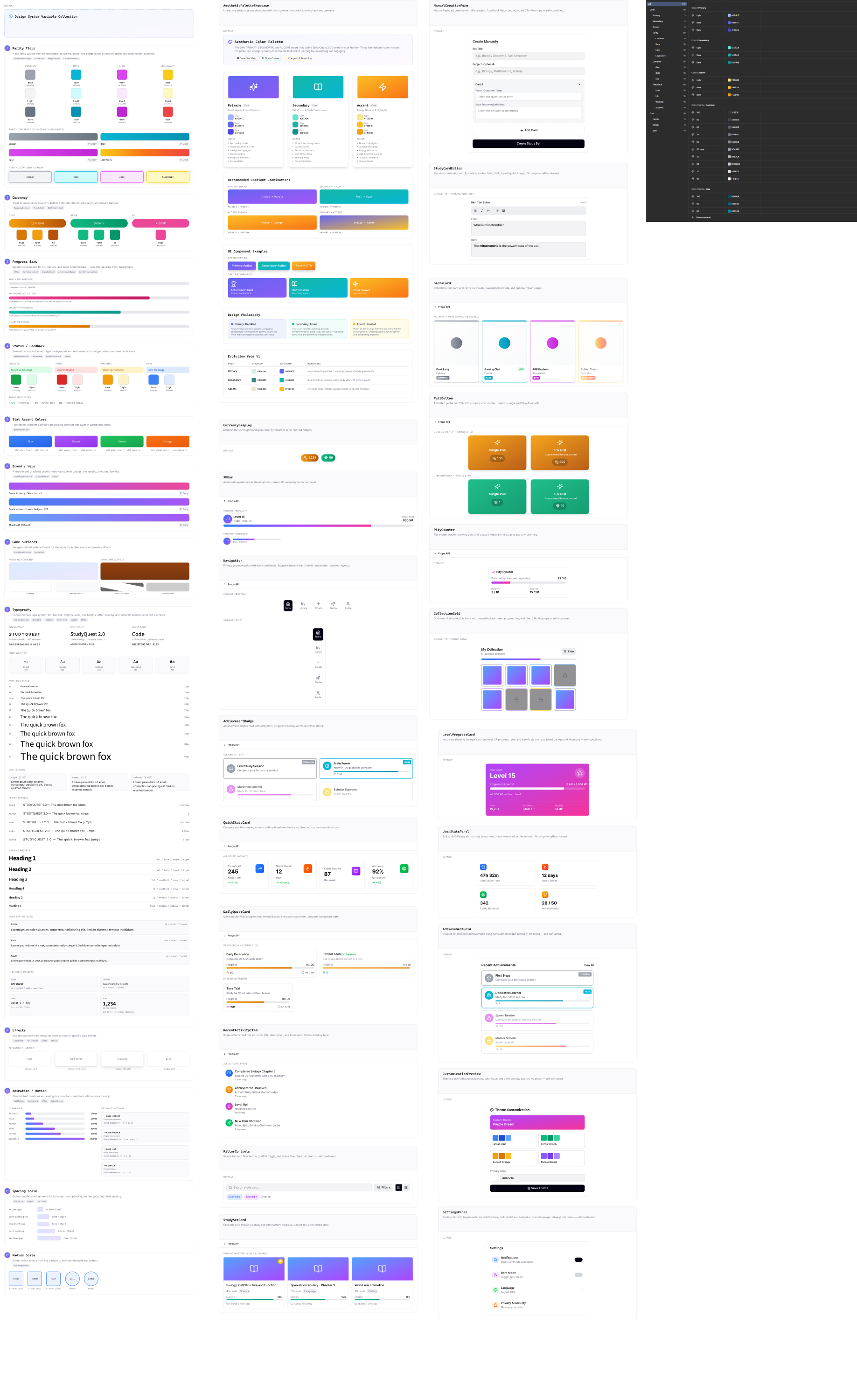
I set up the system before drawing screens. The variable collection covers rarity tiers, currencies, progress bars, status colors, a type scale, motion durations, spacing and radius. On top of that sit about 25 documented components such as XPBar, PityCounter, CollectionGrid and DailyQuestCard.
My heuristic audit scored v1 at 2.6 out of 5.
I ran a heuristic evaluation of the sign-up flow and home screen against Nielsen's 10 heuristics and WCAG basics. Sign-up scored lowest because it was missing validation feedback, error recovery and system status. The home screen did a little better but had the same underlying problems.

| Finding | Why it mattered | Fixed in v2 |
|---|---|---|
| Low color contrast | Several labels fell below WCAG AA. | Tokens rebuilt. All text is 4.5:1 or better, plus a high-contrast mode. |
| Small tap targets | Several icon buttons were too small to tap reliably. | 44px minimum on every control. |
| No feedback | No validation, loading or confirmation states. | Toasts, confirm sheets, invalid-drop states and screen-reader announcements. |
| Weak hierarchy on home | The room was a gray placeholder cube with competing actions. | The room is the hero, with one primary action: Start focus session. |
| Clunky room editing | Moving furniture meant tapping direction arrows one tile at a time. | Drag and drop, tap to rotate, undo and redo. |
What Forest, Duolingo, Finch and Habitica already get right.
Before redesigning, I looked at the products students already use to stay motivated, plus the cozy decorating games the room idea comes from. For each one I asked what works and what I'd take.
| Product | What works | What I took |
|---|---|---|
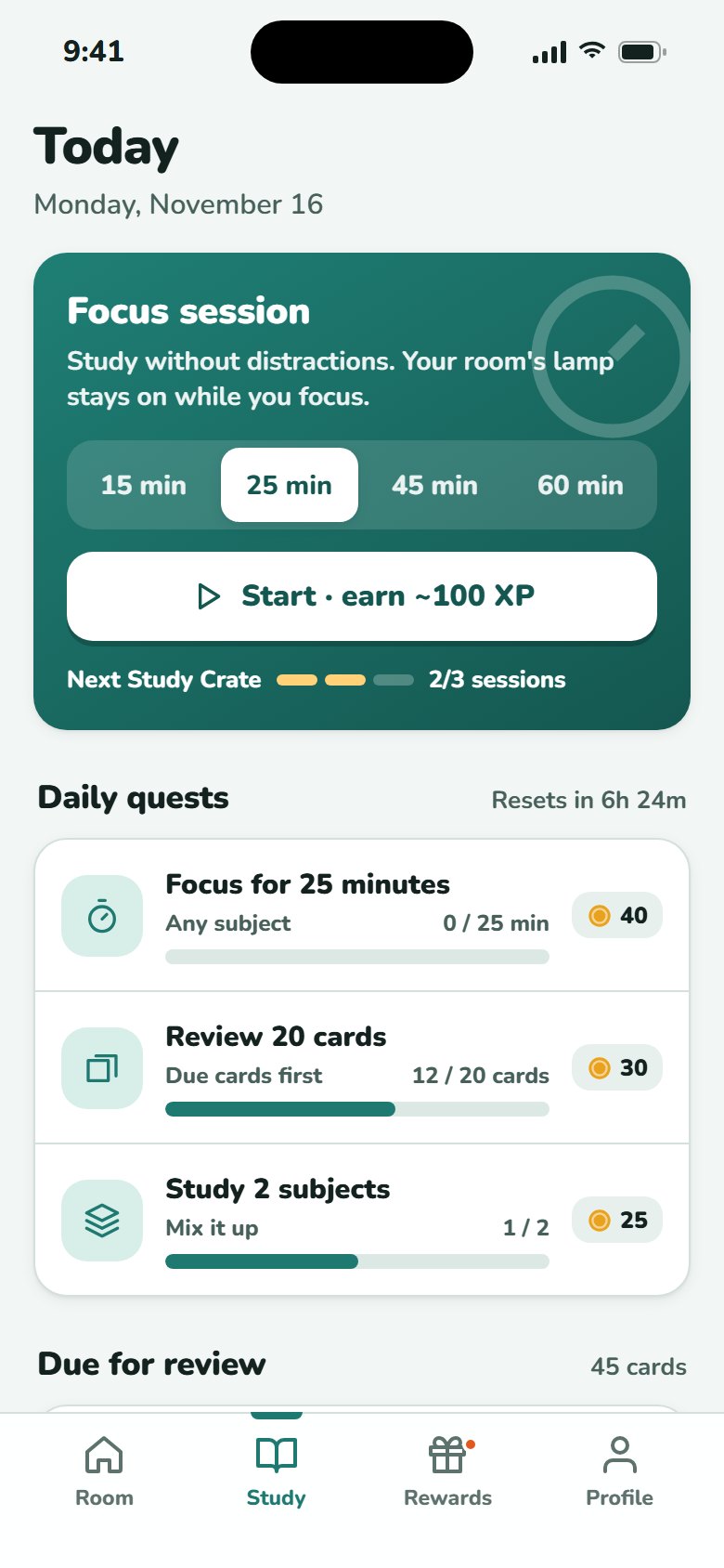
| Forest | Focus time visibly grows something. Leaving early has a cost. | Your room's lamp stays on while you focus. Ending early keeps only half the reward. |
| Duolingo | Streaks, streak freezes and weekly leagues. | Streaks with an auto-used freeze, and a gentle league on the profile. |
| Finch | A pet and a room you decorate as self-care rewards. | Mochi the cat wanders your room and reacts when you tap. |
| Habitica | Tasks framed as quests with RPG rewards. | Daily quests with clear progress and explicit rewards. |
| Cozy sims | Grab, drag and rotate furniture on a grid, with instant validity feedback. | Grid editor with green and red footprints, a rotate button and an inventory tray. |
v1 had a gacha with countdown timers and limited rate-ups. For a study app aimed at students, I felt those FOMO mechanics crossed a line.
Six changes between v1 and v2.
The room is the home screen
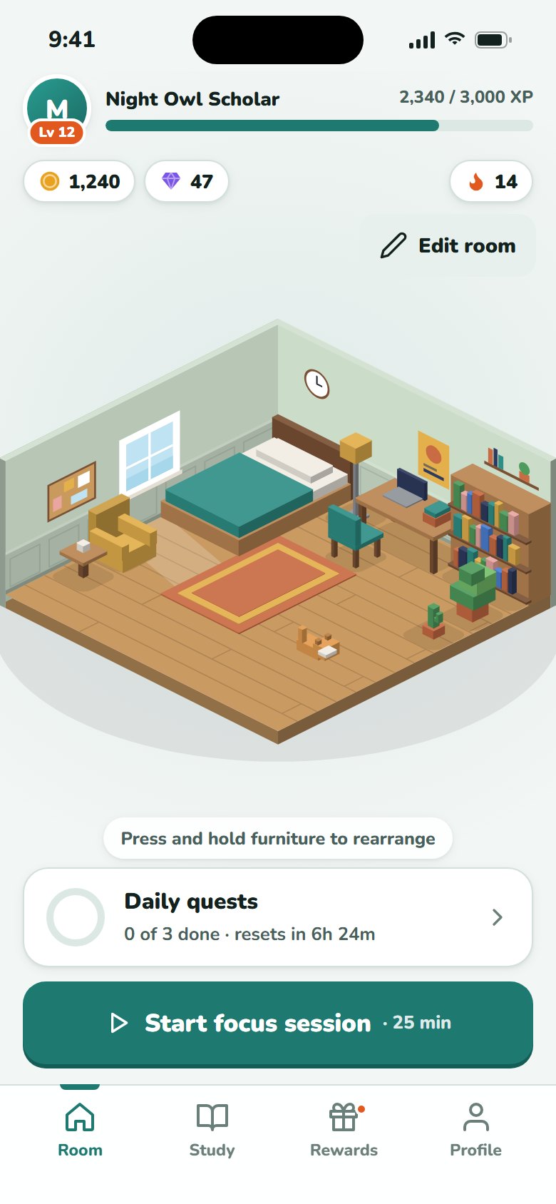
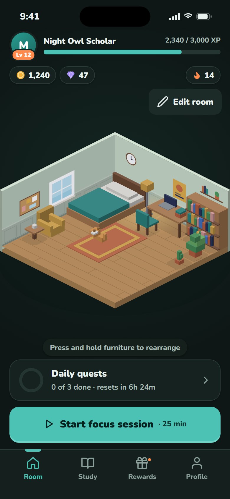
In v1, home was a placeholder cube surrounded by six competing entry points. In v2 the isometric room fills the screen, the HUD shows level, XP, coins and streak at a glance, and there's one primary action: Start focus session. Quests sit one tap away.
Gray cube, side drawer, unclear next step
Your room, your stats, one obvious action
Transfers toDashboard and home-screen hierarchy: one primary action, key status at a glance, everything else one tap away.
Direct manipulation, not arrow keys
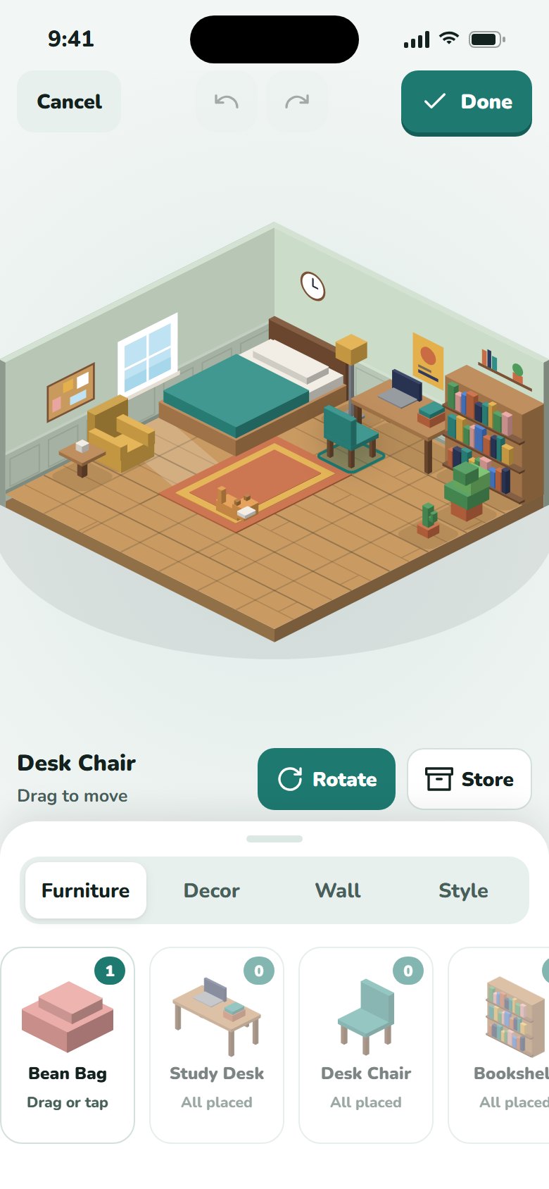
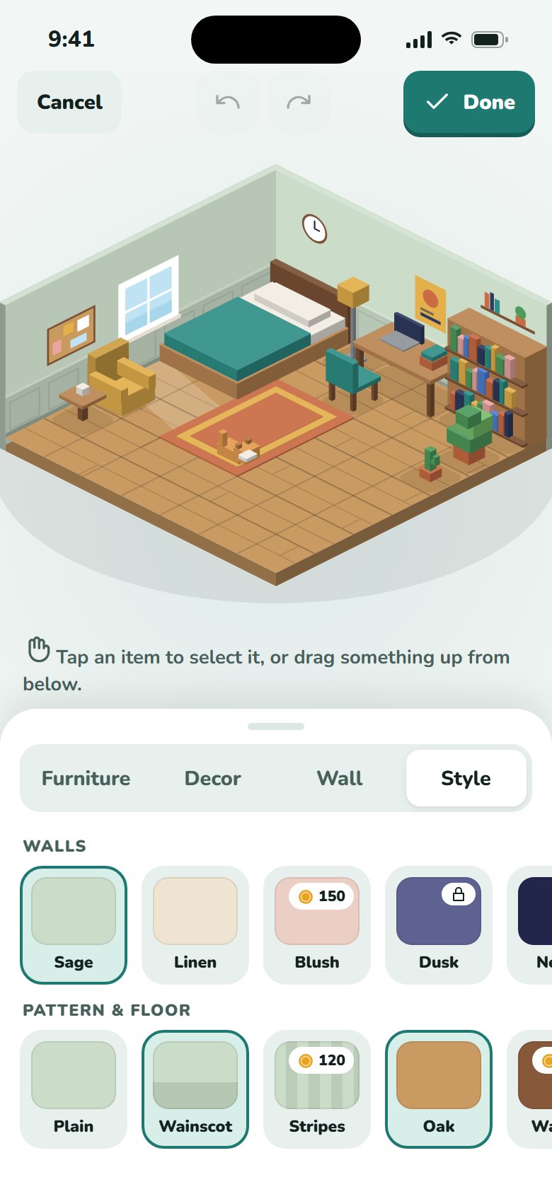
Press and hold any item, or tap Edit room, to start editing. You drag furniture across the grid, and the footprint turns green or red so you know if it fits before you let go. Rotate is a single tap that finds the next orientation that fits. Store sends an item back to the tray, and undo and redo cover every change.
- Drag new items up from the inventory tray, or tap to auto-place them
- Wall decor slides along either wall and moves up and down
- Arrow keys still nudge the selected item as an accessibility fallback only
Transfers toDirect manipulation in any editor (layouts, kanban boards, page builders), with undo/redo and a keyboard alternative.
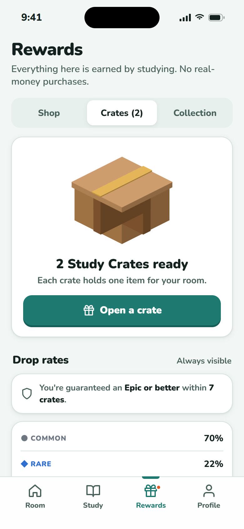
Gacha became Study Crates
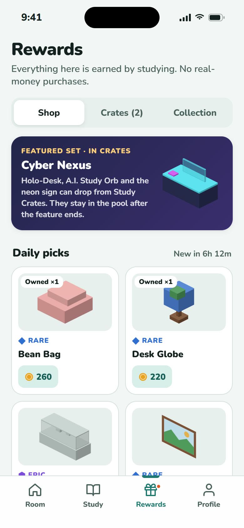
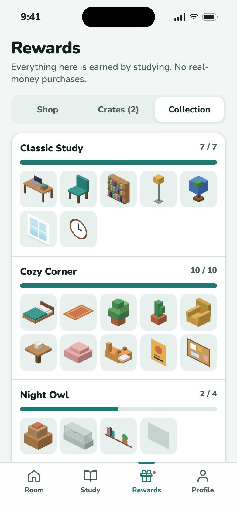
I kept the excitement of an unboxing and removed the FOMO. You can only earn crates by studying: one for every three focus sessions. Drop rates are always on screen. A pity counter guarantees an Epic or better within 10 crates. There's no paid currency, and duplicates stay in your inventory so you can place more than one.
Transfers toEthical engagement and transparent pricing or reward rules. No dark patterns, and odds that are always visible.
Streaks that forgive
Missing one day shouldn't wipe out two weeks of effort. A streak freeze is used automatically and shows up as a blue day in the week view. Reminders only fire if you haven't studied yet, so the app nudges instead of nagging.
Transfers toHabit and retention design that forgives lapses, and notifications that respect the user.
Accessibility as a feature
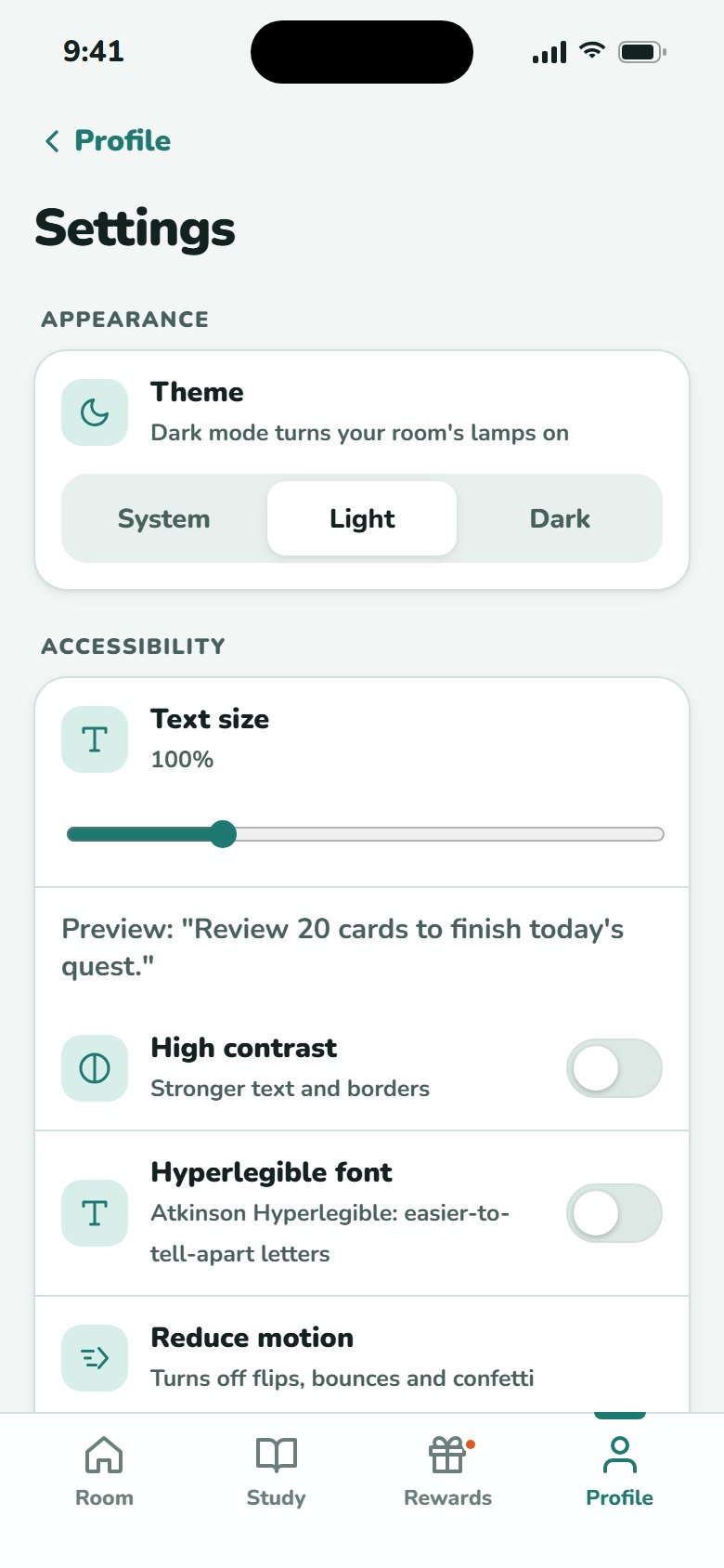
Settings includes:
- Text size from 90% to 130%, and the whole layout scales with it
- High-contrast mode and a full dark theme
- Atkinson Hyperlegible font option
- Reduce motion (follows the system setting by default)
- Rarity shown by shape and label, never color alone
- Live announcements for drags, rotations and rewards
Transfers toWCAG compliance that works as a system: scalable type, contrast modes, motion settings and screen-reader feedback.
Dark mode tells a story
In dark mode the window shows a moon, the room dims, and the lamp casts a warm glow. During a focus session the room always switches to night, which signals that it's time to concentrate.
Transfers toTheming with design tokens, and using state changes (like focus mode) to communicate context.
Platform conventions I followed
The game layer sits on top of standard iOS patterns from Apple's Human Interface Guidelines, so the app feels familiar before it feels playful:
- A bottom tab bar for the four main areas, and bottom sheets for item details and confirmations
- Primary controls at least 44 × 44 pt
- Each accessibility setting maps to its iOS counterpart: Dynamic Type, Increase Contrast, Dark Mode and Reduce Motion
Try the v2 prototype.
This is the v2 prototype itself, not a recording. Your progress saves in your browser.
- Press and hold the bed, then drag it somewhere new
- Select the chair and tap Rotate
- Study → start a focus session → Demo: skip to the end
- Rewards → open a Study Crate → Place in my room
- Profile → Settings → try 130% text with high contrast
Color tokens, checked for contrast.
I kept the teal from v1 so the product is still recognizable, and rebuilt every value around contrast. Ratios are against white. Colors too light for text on white are used for fills, icons and borders. When they need to be text, a darker partner takes over. Each color has a light and a dark value. The isometric room uses its own small palette, shaded automatically: tops are lighter, left faces are mid-tone and right faces are darkest.
What I'd test next.
- Usability test with 5 students: can they find, move and rotate an item without help? Target: 5 out of 5 in under 30 seconds.
- Reward pacing: is one crate per three sessions too slow for week one? I'd try front-loading early crates.
- Retention signal: do people who decorate in week one come back on day 7 more often than people who don't?
- Social: visiting friends' rooms, with privacy controls designed first.
Auditing my own work was the most useful step in the whole project. A 2.6 stings, but it gave me a clear list of what to fix.